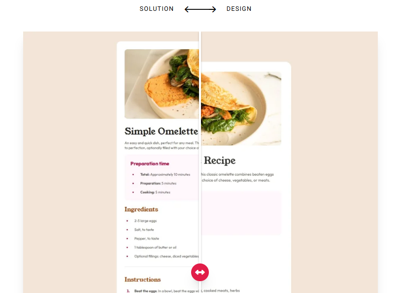
Recipe page main
Solution URL: Github Live Site URL: Vercel
컴포넌트를 많이 분리해서 사용해봤다. 더불어 split을 사용한 map 활용법과 li 태그 사용법, 전역 폰트 설정까지 알 수 있었던 알찬 프로젝트였다.
// App.tsx
...
  return(
    <div className="bg-[#f3e5d8] min-h-screen flex items-center justify-center font-main text-sm text-stone-600">
      <div className="bg-white max-w-170 sm:p-8 sm:my-10 sm:rounded-2xl">
        <img src={omelette} className='w-full mb-8 sm:rounded-xl'></img>
        <div className='space-y-4 px-8 pb-8 sm:p-0'>
          <h1 className='text-4xl font-[YoungSerif-Regular] text-stone-900'>
            Simple Omelette Recipe
          </h1>
          <p>
            An easy and quick dish, perfect for any meal. This classic omelette combines beaten eggs cooked to perfection, optionally filled with your choice of cheese, vegetables, or meats.
          </p>
          <PreparationTime arr={prepartionTimeData}></PreparationTime>
          <Header title="Ingredients"></Header>
          <BulletList arr={ingredientsData}></BulletList>
          <hr className='text-stone-200 my-8'></hr>
          <Header title="Instructions"></Header>
          <NumberList arr={instructionsData}></NumberList>
          <hr className='text-stone-200 my-8'></hr>
          <Header title="Nutrition"></Header>
          <p className='mb-8'>
            The table below shows nutritional values per serving without the additional fillings.
          </p>
          <Table title="Calories" desc="277kcal"></Table>
          <Table title="Carbs" desc="0g"></Table>
          <Table title="Protein" desc="20g"></Table>
          <Table title="Fat" desc="22g" underline={false}></Table>
        </div>
      </div>
    </div>
  );
}

// PreparationTime.tsx
export default function PreparationTime({ arr } : { arr: Array<string> }){
  return(
  <div className="bg-[#fff7fc] p-6 rounded-xl">
    <h1 className="text-rose-800 font-bold mb-5 text-xl">
      Preparation time
    </h1>
    <ul className="list-disc ml-6 space-y-4 marker:text-rose-800 marker:text-sm">
      { arr.map((item, index) => {
        const [ title, desc ] = item.split(':');
        return <li className="pl-4" key={index}><span className="font-bold">{title}: </span>{desc}</li>
      })}
    </ul>
  </div>
);
}
What I Learned
font
index.html에도 적용해보고, 가장 바깥쪽 div 태그에 폰트 클래스를 적용하는 등 여러 시도를 했지만, 결국 정착한건 Tailwind의 커스텀 속성을 적용하는 것이였다. 그 와중 찾아봤던 내용을 적어보았다.
Tailwind CSS @theme
내가 사용하는 Tailwind CSS는 v4여서 tailwind.config.js 파일이 없었다.
v4부터는 CSS 파일 안에서 모든 설정을 직접 관리하는데, @theme 디렉티브를 사용하면 tailwind.config.js 대신 CSS 파일 안에서 직접 디자인을 설정할 수 있다.
@import "tailwindcss";

@theme {
  /* 1. 색상 정의: --color-<이름> */
  --color-primary: #1d2745;
  --color-brand-lime: #d9f99d;

  /* 2. 폰트 정의: --font-<이름> */
  --font-main: "Pretendard", sans-serif;

  /* 3. 간격/사이즈 정의: --spacing, --text 등 */
  --spacing-100: 25rem;
  --text-huge: 5rem;
}
@theme 블록 안에 정의한 변수를 클래스 명으로 사용하면 된다. (ex. className=“font-main”)
Tailwind v4는 @theme 블록 안에 선언된 변수명의 중간 키워드를 보고 이것이 어떤 종류의 유틸리티 클래스가 될지 결정한다. 따라서 변수 명을 지정할 떄는 Tailwind CSS v4의 명명 규칙을 따라야한다.
Tailwind CSS v4의 명명 규칙 폰트: —font- (➔ font-) 색상: —color- (➔ text-, bg-, border-) 크기: —text- (➔ text-) 간격: —spacing- (➔ m-, p-, gap-) 그림자: —shadow- (➔ shadow-)
Tailwind CSS @theme 전역 폰트 설정
TailWind CSS를 import하면 브라우저의 기본 스타일을 초기화하는 Prefilght 코드가 자동으로 삽입되는데, 여기서 —font-sans라는 변수가 전역 폰트로 설정되어있다. 따라서 @theme 블록 내에서 —font-sans 변수를 내가 쓰는 폰트로 변경하면 전역으로 폰트가 설정된다. (적용한 뒤 바로 보이지 않을 때는 웹 캐시를 지워보자.)
@import 'tailwindcss';

@font-face {
  font-family: 'YoungSerif-Regular';
  src: url('./assets/fonts/young-serif/YoungSerif-Regular.ttf');
}

@font-face {
  font-family: 'Outfit-VariableFont_wght';
  src: url('./assets/fonts/outfit/Outfit-VariableFont_wght.ttf');
}

@theme {
  --font-sans: 'Outfit-VariableFont_wght', system-ui, sans-serif;
}
뒤쪽에 있는 system-ui는 2순위로 실행되는 폰트로, OS의 UI에 적용된 폰트를 그대로 보여주는 키워드이다. sans-serif는 3순위로 실행되는 폰트로, 웹 표준 고딕체를 출력한다.
index.html의 class 전역 폰트 설정
이렇게 해도 안되면 index.html의 body에 class로 @theme에 설정한 커스텀 폰트를 적용한다.
가장 바깥 div의 className 전역 폰트 설정
3번보다 조금은 더 유연한 방법으로, index.html이 아니라 App.tsx 내부에서 가장 바깥 div 태그의 className에 @theme에 설정한 커스텀 폰트를 적용한다.
Layout
카드 세로 높이 맞춤
max-h-fit 속성을 써서 카드 내용에 맞게 카드 높이를 맞출 수 있다.
데스크톱, 모바일 반응형 속성 적용
sm: 을 사용하면 sm(가로 너비 640px) 크기 이상일 때 속성을 지정할 수 있다. Tailwind에서 클래스를 작성할 때는 작은 화면에서 큰 화면으로 생각을 해야한다. 따라서 기본은 모바일 속성으로 작성하고, 화면이 커지면 속성을 추가하는 형식으로 설정한다.
<div class="p-4 sm:p-10">
  반응형 박스
</div>
위 코드에서 기본 패딩은 16px(p-4)이지만, 화면이 커지면 40px(p-10)으로 변한다.
높이 사이 간격 띄우기
부모 태그에서 flex, flex-col, gap-4를 사용해도 되지만, space-y-4를 사용하면 더 편하다.
JSX
JSX 내부에서의 화살표 함수
JSX 코드 내부에서 화살표 함수를 사용할 때, 화살표가 가리키는 것이 괄호인지 중괄호인지에 따라 차이가 있다. 괄호일 때는 바로 return 하는 JSX 요소가 와야하고, 다른 로직은 추가할 수 없다. 중괄호일 때는 다른 로직을 추가할 수 있고, JSX 요소를 return하는 return 문이 반드시 포함되어야한다.
나는 괄호을 쓰고 JSX 내부에서 split 로직을 쓸 수 없어 당황했었는데, 로직을 추가해야할 때는 중괄호를 써야하는 것을 잊지말자.
map에서의 split 사용
arr로 저장 해 활용한다. (구조 분해 할당하면 더 편함)
    <ul className="list-disc ml-6 space-y-4 marker:text-rose-800 marker:text-sm">
      { arr.map((item, index) => {
        const [ title, desc ] = item.split(':');
        return <li className="pl-4" key={index}><span className="font-bold">{title}: </span>{desc}</li>
      })}
    </ul>
marker
ul, ol에서 불렛이나 숫자 넣기
className에 list-disc를 넣으면 불렛이, list-decimal를 넣으면 숫자가 좌측에 표시된다. 단, 마진이 자동으로 주어지지는 않으므로 ml-6를 줘서 왼쪽 사이 간격을 띄워주는 것이 좋다. 불렛이나 숫자에서 글을 띄울 때는 li 태그에 pl-4를 줘서 글 왼쪽 패딩을 넣어 공간을 맞춘다.
불렛이나 숫자 속성 바꾸기
marker: 를 입력하고 속성을 넣으면 불렛이나 숫자의 색상이나 크기를 조절할 수 있다.
Continued Development
CSS의 변수
CSS에도 변수라는 개념이 있다보다, 확인해보자.