로그인 UI 실습
폼 다루기 챕터 마무리 실습으로 로그인 UI Validation 로직을 짜는 예제가 나왔다. 문제 자체는 UI는 제공하고 로직만 짜는 것으로 나왔는데, Frontend Mentor 프로젝트를 하며 Tailwind CSS에 좀 익숙해져서 UI 부터 로직까지 직접 한 번 짜 보았다. (제어 컴포넌트 방식 사용)
UI
내 코드
TailWind로 UI 구현하는건 크게 어려움이 없었다. 하나 어려웠던건 체크박스와 옆의 라벨 글자를 일직선 상에 배치하는 것이였는데, 글자를 span 태그로 한 번 감싸 부모 태그에 flex 속성을 주어 해결하였다.
          <label className="text-sm flex items-center">
            <input type='checkbox' className='mr-2' required></input>
            <span>
              I agree with <span className="font-bold">terms</span> and <span className="font-bold">policies</span>.
            </span>
          </label>
정답 코드와 비교
구현한 코드 자체는 비슷했지만, 내가 몰랐던 속성을 쓴 부분이 있어서 정리했다.
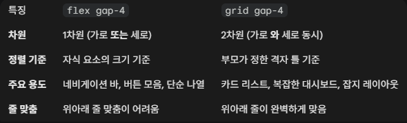
grid gap-4
grid gap-4를 사용하면 flex gap-4로 사용한 것 처럼 자식 간의 간격이 벌어진다.
하지만 grid 레이아웃이 되어서 flex 레이아웃보다는 좀 더 위아래 줄이 완벽하게 맞게된다고 한다.
이 부분은 나중에 다시 확인해볼 예정이다.
체크박스 체크 이미지 교체
정답 코드에서는 브라우저 기본 체크 UI가 아닌, 직접 등록한 이미지를 체크할 때 출력하도록 교체했다. 사용한 속성은 appearance-none, checked:bg-[url(’./check-icon.svg’)], checked:bg-no-repeat, checked: bg-center 이다.
appearance-none은 브라우저가 기본적으로 제공하는 운영체제 특유의 UI 스타일을 제거할 때 사용하는 속성이다.
**checked:**는 상태 변조자로, HTML 요소의 상태가 checked일 때만 뒤에 오는 스타일을 적용한다.
**bg-[url(’./check-icon.svg’)]**는 배경으로 url에 등록한 커스텀 아이콘을 출력하겠다는 의미이다.
bg-no-repeat은 아이콘이 바둑판처럼 반복되는 것을 막고, bg-center은 아이콘을 정중앙에 위치시킨다.
로직
내 코드
HTML 기본 Validation
import { useState } from "react";

export default function App() {
  const [ email, setEmail ] = useState('');
  const [ password, setPassword ] = useState('');

  const handleEmail = (e: React.ChangeEvent<HTMLInputElement>) => {
    setEmail(e.currentTarget.value);
  }

  const handlePassword = (e: React.ChangeEvent<HTMLInputElement>) => {
    setPassword(e.currentTarget.value);
  }

  const handleSubmit = (e: React.FormEvent<HTMLFormElement>) => {
    e.preventDefault();
    alert('로그인에 성공했습니다.');
  }

  return(
    <div className="flex justify-center items-center min-h-screen">
      <div className="border rounded-md m-8 p-8 w-full max-w-sm space-y-4">
        <h1 className="font-bold font-xl">
          Login Into App
        </h1>
        <p className="text-xs">
          Please enter your details to continue.
        </p>
        <form onSubmit={handleSubmit} className="flex flex-col gap-4">
          <input value={email} onChange={handleEmail} type="email" required className="border rounded-md py-1 px-2 text-sm" placeholder="someone@example.com"></input>
          <input value={password} onChange={handlePassword} type="password" required className="border rounded-md py-1 px-2 text-sm" placeholder="Enter Password"></input>
          <label className="text-sm flex items-center">
            <input type='checkbox' className='mr-2' required></input>
            <span>
              I agree with <span className="font-bold">terms</span> and <span className="font-bold">policies</span>.
            </span>
          </label>
          <button type="submit" className="bg-black text-white rounded-md w-full py-3 text-sm">Log in</button>
        </form>
      </div>
    </div>
  );
}
첫번째로 구현한 방식은 HTML 기본 Validtion을 사용한 방법이였다. 기본적인 Validtion과 오류가 난 해당 필드 입력란으로 자동으로 커서가 옮겨지는 기능은 동작하지만, 실습 문제에서 요구한 경고창은 팝업되지 않았기 때문에 여기에서 디벨롭해서 커스텀 Validation으로 넘어갔다.
커스텀 Validation
import { useRef, useState } from "react";

interface ErrForm {
  email?: string;
  password?: string;
  checked?: string;
}

export default function App() {
  const [ loginInfo, setLoginInfo ] = useState({
    email: '',
    password: '',
  });
  const [ err, setErr ] = useState<ErrForm>({});

  const emailEl = useRef<HTMLInputElement>(null);
  const passwordEl = useRef<HTMLInputElement>(null);
  const checkedEl = useRef<HTMLInputElement>(null);

  const handleLogin = (e: React.ChangeEvent<HTMLInputElement>) => {
    setLoginInfo({
      ...loginInfo,
      [e.target.name]: e.target.value
    })
  }

  const handleSubmit = (e: React.FormEvent<HTMLFormElement>) => {
    e.preventDefault();
    if (validate()) {
      setTimeout(() => {
        alert('로그인에 성공했습니다.');
      }, 0);
    }
  }

  const validate = () => {
    const newErrors: ErrForm = {};

    if (loginInfo.email.trim() === '') {
      newErrors.email = '이메일을 입력하세요.';
    } else if (!loginInfo.email.includes('@')) {
      newErrors.email = '이메일 형식이 맞지 않습니다.';
    }

    if (loginInfo.password.trim() === '') {
      newErrors.password = '비밀번호를 입력하세요.';
    }

    if (!checkedEl.current?.checked) {
      newErrors.checked = '약관에 동의 해 주세요.';
    }

    setErr(newErrors);

    const isValid = Object.keys(newErrors).length === 0;

    if (!isValid) {
      if (newErrors.email) emailEl.current?.focus();
      else if (newErrors.password) passwordEl.current?.focus();
    }

    return isValid;
  };

  return(
    <div className="flex justify-center items-center min-h-screen">
      <div className="border rounded-md m-8 p-8 w-full max-w-sm space-y-4">
        <h1 className="font-bold font-xl">
          Login Into App
        </h1>
        <p className="text-xs">
          Please enter your details to continue.
        </p>
        <form onSubmit={handleSubmit} className="flex flex-col gap-4" noValidate>
          <input ref={emailEl} value={loginInfo.email} onChange={handleLogin} name="email" type="email" required className="border rounded-md py-1 px-2 text-sm" placeholder="someone@example.com"></input>
          { err.email ? <p className="text-red-500">{err.email}</p> : undefined }
          <input ref={passwordEl} value={loginInfo.password} onChange={handleLogin} name="password" type="password" required className="border rounded-md py-1 px-2 text-sm" placeholder="Enter Password"></input>
          { err.password ? <p className="text-red-500">{err.password}</p> : undefined }
          <label className="text-sm flex items-center">
            <input ref={checkedEl} type='checkbox' className='mr-2' required></input>
            <span>
              I agree with <span className="font-bold">terms</span> and <span className="font-bold">policies</span>.
            </span>
          </label>
          { err.checked ? <p className="text-red-500">{err.checked}</p> : undefined }
          <button type="submit" className="bg-black text-white rounded-md w-full py-3 text-sm">Log in</button>
        </form>
      </div>
    </div>
  );
}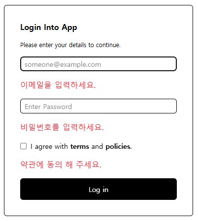
구현할 때 경고창(alert)을 에러메시지로 순간 착각해서 에러메시지를 출력하는 코드를 짜버렸다… 하지만 에러메시지 출력하는 곳에 경고창 출력 로직을 추가하면 동작해서, 이렇게 마무리를 지었다.🙃
스스로 허들을 높인 탓인지 validate 로직을 짤 때 오류가 좀 있었다.
// 초기 코드
  const validate = () => {
    if (loginInfo.email.trim() === '') {
      setErr({
      	...err,
        email: '이메일을 입력하세요',
      });
      emailEl.current?.focus();
      return false;
    } else if (!loginInfo.email.includes('@')) {
      setErr({
      	...err,
        email: '이메일 형식이 맞지 않습니다.',
      });
      emailEl.current?.focus();
      return false;
    }
	...

    setErr({});
    return true;
  };
초기 코드에서는 상태가 명령하는 즉시 바뀐다고 착각을 했다. setErr를 실행하면 err 값이 즉시 바뀐다고 생각하여 …err로 이전 값을 계속 복사해서 사용했는데, useState는 비동기로 동작하여 setErr를 호출한다고 해서 그 즉시 err 변수가 업데이트되는 것이 아니라, 함수가 다 끝나고 다음 렌더링 때 반영이 된다. 이런 경우는 이전에 공부했던 것 처럼 매개변수를 넣은 함수 콜백 형태(setErr((prev)=>{})를 사용하면 정상적으로 동작한다.
하지만 이 로직의 경우는 빈 로컬 에러 변수를 하나 만들어 한 번에 파악하고 한 번에 반영하는 쪽이 더 로직이 깔끔해 다음과 같이 수정했다.
// 수정 코드
  const validate = () => {
    const newErrors: ErrForm = {};

    if (loginInfo.email.trim() === '') {
      newErrors.email = '이메일을 입력하세요.';
    } else if (!loginInfo.email.includes('@')) {
      newErrors.email = '이메일 형식이 맞지 않습니다.';
    }

    ...

    setErr(newErrors);

    const isValid = Object.keys(newErrors).length === 0;

    if (!isValid) {
      if (newErrors.email) emailEl.current?.focus();
      ...
    }

    return isValid;
  };
정답 코드와 비교
에러메시지 출력 부분 빼고는 정답 코드와 로직이 차이가 난 부분은 달리 없었다.